
When the first travelers enter the new terminal at Pittsburgh International Airport (PIT) on Tuesday, they’ll notice more changes than just the spacious, gleaming new building that greets them.
PIT has completely updated its signage as part of a $1.7 billion renovation of the former US Airways hub in western Pennsylvania that opened Tuesday. Everything from physical wayfinding to flight information displays known as “FIDS” has a new look and feel that’s unique to Pittsburgh.
New black and yellow pylons—yes, they do draw inspiration from Pittsburgh’s sports teams—stand at the entrance beneath a soaring wooden ceiling, directing travelers to their respective airline counters or security checkpoints to board their flights.
“The intention is to make them very visible,” said Siri Betts-Sonstegard, who oversees experience and design for the Allegheny County Airport Authority, operator of the PIT.
Or, in the words of Gensler environmental graphic designer Kristal Ernst, who worked on the PIT project, “bold and impactful.”
The update comes as airports across the country and around the world are re-evaluating signage and the information they present in the digital age. There are only static signs in the airport that guide travelers through the airport but do little more than provide basic information: airline, flight, destination, gate and departure time. In is a combination of static and digital displays designed to integrate data from the data-rich world we live in to improve the passenger experience.
“The key is being able to add more layers on top of the core signage program and communicate in other ways, and the wayfinding program is necessary for people to navigate the airport,” says Rob Daly, principal at Entro, a Toronto-based experience design and signage firm that has worked on airport signage projects around the world.
From New York’s LaGuardia Airport (LGA) to Minneapolis-St. Louis, airports across the country have installed dynamic and data-rich airport signage. St. Paul International Airport (MSP) and San Francisco International Airport (SFO), with more airports under construction. Globally, it has been showcased at places like Singapore Changi Airport (SIN).
The challenge for PIT was to design a “bold and impactful” signage system that would not detract from the new terminal itself. The building rises more than three stories tall, with its iconic roof positioned between the two arms of the airport’s more than 30-year-old X-shaped concourse. It replaces PIT’s 1992 terminal and the automated subway connecting it to the concourse.

Reward your inbox with the TPG daily newsletter
Join over 700,000 readers and get breaking news, in-depth guides and exclusive offers from TPG experts
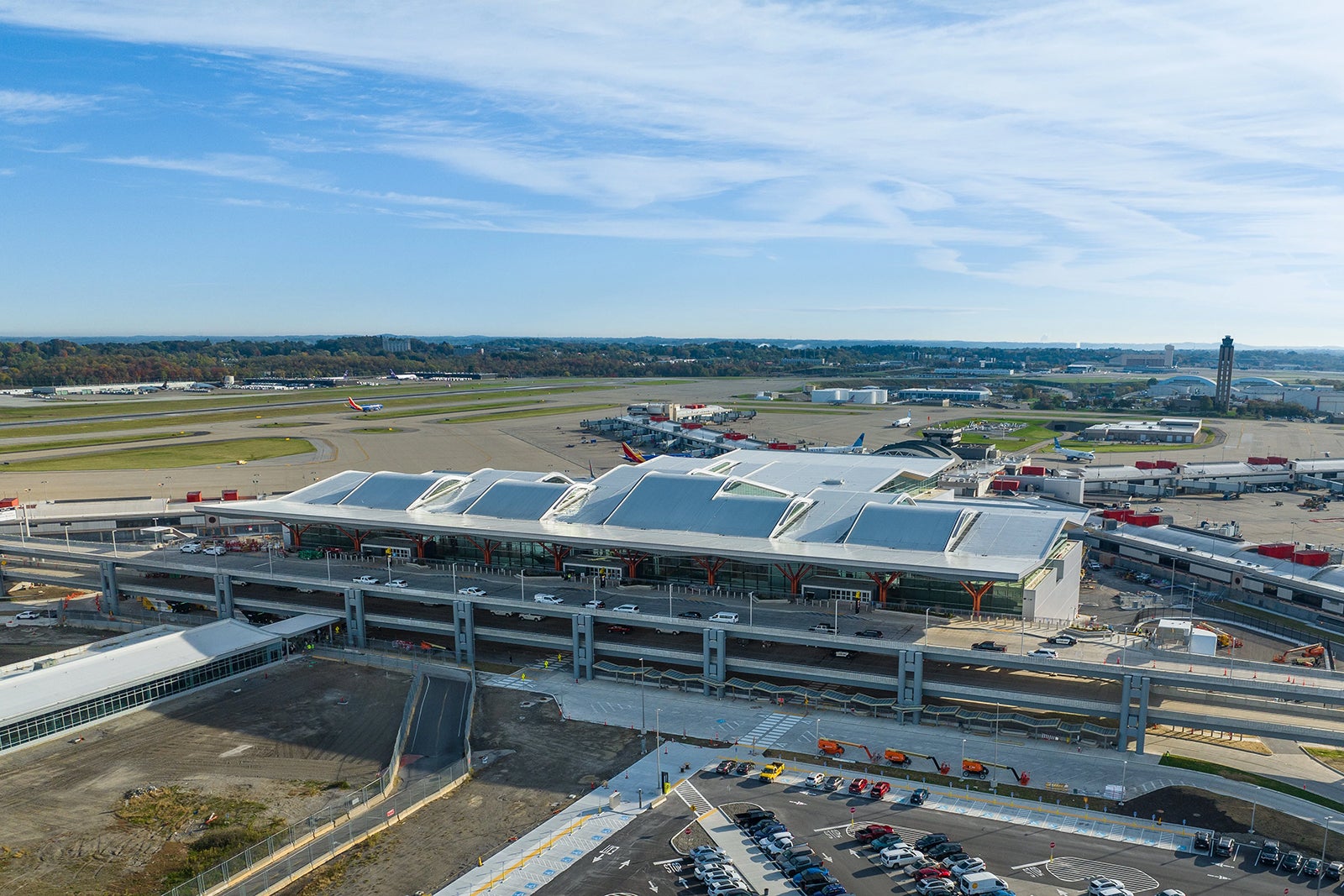
“The new building is so wide, so big, so vast, and has such a good natural flow, that it doesn’t need a lot of signposting,” Ernst said. “What it really needs is a larger, recognizable moment.”
While the most eye-catching moment is undoubtedly the Alexander Calder mobile suspended in the center of the terminal, the yellow and black pylons and FIDS lined with locally sourced wood create their own moments in the space – however brief.
Gensler collaborated with HDR and Luis Vidal + Architects to design the terminal.
As part of the signage overhaul, PIT also updated how and what information is displayed. The job fell to Sascha Mombartz, a New York-based designer and digital product expert.
“We’re trying to guide people through a space,” he said. “This is indeed a statistic [visibility] project.”
Mombartz worked with the PIT team to come up with the information hierarchy and how to display it on FIDS. He drew inspiration from flip-up signs, plastic strips with basic flight information that airline personnel could load onto towers or remove that were once standard at airports across the country.
One can see the beauty of the flipped logo on the FIDS display, and each flight actually has its own digital information card.
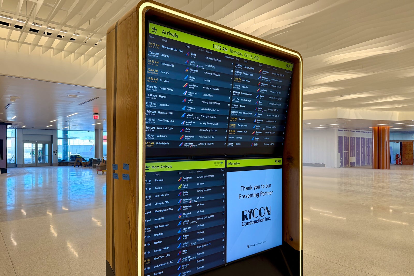
The two biggest changes travelers will notice in PIT are the decision to list flights by departure time rather than destination, and the inclusion of airline information in FIDS.
Mombatz said sorting flights by departure time is common around the world, but not in the United States. PIT made this change to improve the process for travelers.
“You can see what’s at the top is [soonest],” he said. “Finding your flight is easy because you just scan the list by time – which makes things a lot easier. “
The test will be whether U.S. tourists — especially those who don’t call Pittsburgh home — adapt to the change.
The addition of the airline tail adds a unifying visual element to help travelers search for flights. The airline name is included next to the icon so passengers don’t have to differentiate between American Airlines’ tail and Southwest’s tail.
“If it has a tailfin and a name, that’s a great solution and very practical in this use case because you can create a very uniform layout,” Mombatz said. “You want to be able to scan very quickly.”
PIT’s new gate tower displays useful information such as boarding time and codeshare flight number below the airline, destination and departure time.

One benefit of mixing digital with static signage is that PIT can display other images on the display (such as photos highlighting local areas) when flight information is not required.
All of these changes will be on display for travelers as they pass through the new PIT terminal.
The first flight expected to arrive at the terminal is United Airlines flight UA794, which departed San Francisco International Airport (SFO) on Monday night and landed at PIT at 5:12 a.m. on Tuesday. The first flight is Southwest Airlines flight WN1841 from PIT to Denver International Airport (DEN) at 5:30 AM
Related reading:


